* * * This page has been archived. These are a mix of old school, research, professional, and passion projects that I am no longer working on. * * *
Old Projects
201903
Produced 300+ tutorial videos for Math Academy's online learning system. The goal was to produce high-quality yet inexpensive videos (at a rate of 2-3 hours/video) to accompany written tutorials in Math Academy's online learning platform. |
201902
Wrote a textbook series that covers the foundations of high school and college math: Algebra, Calculus, and Linear Algebra (with Differential Equations baked into the latter two). The goal was to provide deep intuition for the core concepts and connections, along with plenty of practice exercises, while remaining as concise as possible. |
201901
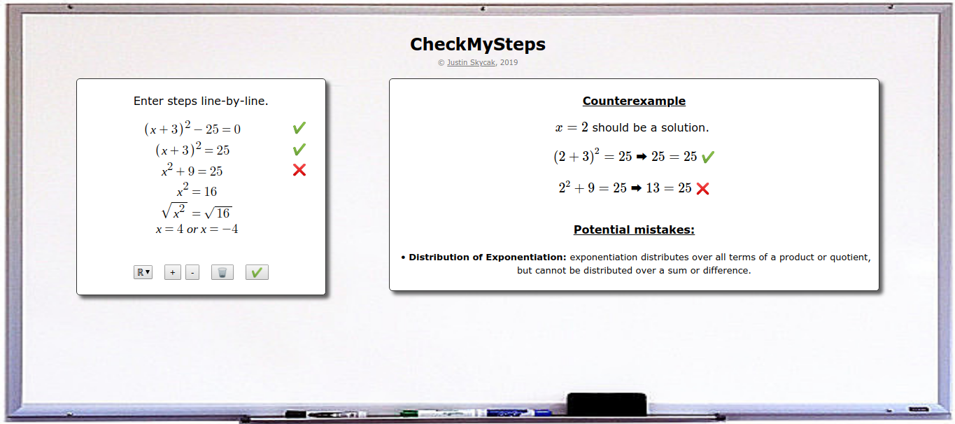 CheckMySteps: A Web App to Help Students Fix their Algebraic Mistakes (2019) CheckMySteps: A Web App to Help Students Fix their Algebraic Mistakes (2019)Developed a web app that automatically detects and explains mistakes when solving and simplifying algebraic equations. Course: CS 6460 (Educational Technology) at Georgia Tech Links: writeup (html, pdf), talk, slides Summary: Many students struggle in mathematics due to technical misconceptions in solving equations and simplifying expressions, such as forgetting to FOIL when multiplying expressions, or forgetting to divide both terms of the numerator in a fraction. $$\begin{align*}\mbox{FOILing error: } (x+2)^2 \rightarrow x^2+2^2 \rightarrow x+4\end{align*}$$ $$\begin{align*}\mbox{Division error: } \frac{x+1}{x} \rightarrow \frac{1+x\hspace{-0.3cm}/}{x\hspace{-0.3cm}/} \rightarrow 1\end{align*}$$ As a result, mathematics educators spend significant time and effort engaged in a repetitive process of searching student work for these misconceptions, demonstrating that they are indeed incorrect, and explaining how to correct them. This is an inefficient process, because students are sometimes able to correct their own misconceptions when given a generic explanation of their error. An extreme case of student self-correction is so-called "silly" mistakes, where the student understands a concept but makes a careless error on a question they would normally answer correctly. Students especially skilled at self-correction are sometimes even able to teach themselves new concepts, if given some guidance on what their error might be. To this end, there appears to be a use-case for a web application that automatically assists students in self-correcting small errors and minor misconceptions, thus enabling teachers to focus their time on explaining major misconceptions that cannot be self-corrected by students. A prototype web app, CheckMySteps, has been implemented as a notebook environment where students enter their steps line-by-line as they solve equations or simplify expressions. Each line is checked against the previous line for mistakes, and if a mistake is detected, then an example input is chosen to demonstrate the discrepancy, and feedback is generated regarding common misconceptions that may potentially form the basis of the mistake. In particular, this "potential mistakes" feedback classifies the student's mistake as a potential violation of some algebraic rule(s), and informs the student of the correct interpretation of the algebraic rule(s). |
201803
Developed a model to predict patient readmission using coded features and clinical notes. Course: CSE 6250 (Big Data for Health Informatics) at Georgia Tech Collaborators: Stan Arefjev, Luis Fernandez-Rocha, Devan Stormont (Georgia Tech) Link: writeup Summary: The purpose of this project is to develop a model that will predict patient readmission from the MIMIC-III database using coded features and clinical notes. The goal is to predict unplanned patient readmission with a higher ROC AUC score than prior published work [RAJKOMAR]. The approach taken to accomplish this is three fold. First we build a data pipeline to find all readmission events for labeling, as well as processing the coded features from the dataset. Next, the clinical notes are processed using Natural Language Processing (NLP) in order to build additional predictive features. Finally, a Recurrent Neural Network (RNN) is used to train and test the combined processed data in order to make final predictions and calculate the ROC AUC score. |
201802
Explained how various predictive algorithms function and relate to each other, to an audience who is familiar with the algorithms but does not yet intuit their underlying math and see how they fit together. Link: writeup Summary: The goal of this write-up is to connect concepts in machine learning by showing how they relate to each other in a mathematically rigorous yet "story-like" fashion. It is intended for an audience who is familiar with some of the machine learning algorithms but for whom they are not yet intuitive. The story starts out with wanting to model data when we have little knowledge about the process that generates it. We see that the Bayesian optimal model, given some parameter set, is an average over all possible parameters. However, since this average is infeasible to compute, we settle for picking the model that computes most to the average (MAP, MLE). This leads us into an exploration of linear regression, support vector machines, neural networks, and decision trees, over which we gradually transition from using theoretical principles to heuristic techniques. We conclude with ensemble methods as a way to break free from the constraints of a single model and avoid overfitting even when using models that are prone to doing so. This brings us around full-circle to the Bayesian optimal model, which itself can be interpreted as an ensemble model, and which we can attempt to approximate with strategically-chosen ensembles.  |
201801
Visualized which donors funded which themes throughout the years. (This also required classifying grants into high-level themes based on titles and descriptions.) Links: site Summary: This is a visualization of which donors funded which themes throughout the years. The given dataset consisted of grant records and included donors/recipients, dates/amounts, and titles/descriptions. First, I tagged grants into themes according to keywords in the title and description. Then, for each theme in each year, I computed each donor's average grant amount, total giving, and total giving in that theme as a percent of the donor's total giving in all themes. I visualized the results in an animated dot plot for each theme. 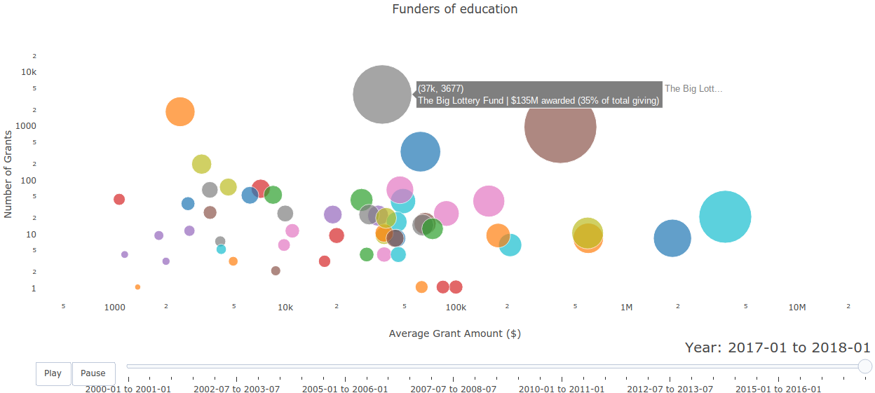 |
201705
Built a random forest model to predict customer churn with 80% precision. Advisors: Dave Cieslak & Chirag Mandot (Aunalytics) Summary: The goal of this project was to predict the risk that any given media subscriber would cancel their subscription within the next 3 months. This way, the client media company could prioritize at-risk customers and "pull them back in" by contacting them about their experience, resolving any problems the customer might bring to light, and waiving the next month's subscription charge. The available customer data consisted of singular features such as residence/age/estimated income, as well as time-series features such as date/type/price of past subscriptions and the dates of complaints/service calls. Each time-series feature was converted into several singlular variables by aggregating over time windows leading up to the current date, and various models (linear regression, SVM, random forest, neural network) were back-tested over roughly a decade of available data. The random forest yielded the best performance -- for every 5 predictions that a customer would cancel their subscription, about 4 were correct. The model was implemented into production and runs daily to update the client's risk score dataset. |
201704
Honors bachelor's thesis -- explained the basic theory behind topological data analysis and demonstrated its applications in visualizing high-dimensional data. Advisors: Mark Behrens (Notre Dame), Dave Cieslak (Aunalytics) Presented at: Brown Bag Lunch Talk at Aunalytics, Glynn Honors Program at Notre Dame Links: thesis, slides, slides from earlier talk Summary: Topological Data Analysis, abbreviated TDA, is a suite of data analytic methods inspired by the mathematical field of algebraic topology. TDA is attractive yet elusive for most data scientists, since its potential as a data exploration tool is often communicated through esoteric terminology unfamiliar to non-mathematicians. The purpose of this guide is to bridge the communication gap between academia and industry, so that non-mathematician data scientists may add current TDA methods to their analytic toolkits and anticipate new developments in the field of TDA. The guide begins with an overview of Mapper, a TDA algorithm that has recently transitioned from academia to industry with commercial success. We explain the Mapper algorithm, demo open-source software, and present a handful of its commercial use-cases (some of which are original). 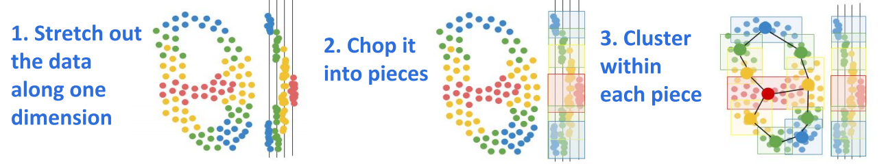 Then, we switch to persistent homology, a TDA method that has not yet broken through to industry but is supported by a growing body of academic work. We explain the intuition behind homotopy, approximation, homology, and persistence, and demo open-source persistent homology software. 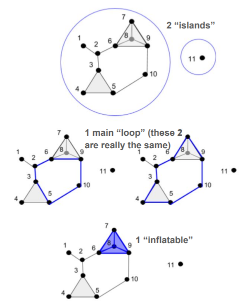 It is hoped that the data scientist reading this guide will be inspired to give Mapper a try in their future analytic work, and be on the lookout for future developments in persistent homology that push it from academia to industry. |
201703
Showed how calculus connects not only to science, technology, and engineering; but also to history, philosophy, business, art, and athletics. Link: packet Summary: Calculus is much more fun to learn when we see how it connects to the real world -- and not just STEM subjects, but also business, athletics, and the liberal arts. Even string art has ties to calculus! 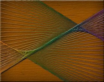 |
201702
Wrote an introductory lesson to build intuition behind core concepts in calculus. Link: packet Summary: This primer explains the intuition behind the core concepts that tie together all of single-variable calculus, using many analogies and visual aids. Understanding these core concepts makes it to understand the technical details of calculus later on, because one can then see where they fit in the big picture of calculus. 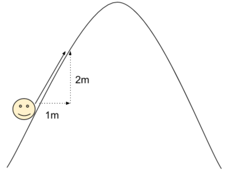 |
201701
Evaluated the potential of topological data analysis for Aunalytics by using it to visualize Reddit data. Advisor: Dave Cieslak (Aunalytics) Presented at: Brown Bag Lunch Talk at Aunalytics Link: slides Summary: The goal of this project was to evaluate the potential of topological data analysis for Aunalytics by demoing it on a toy project, visualizing population segments on Reddit. Applying the Mapper algorithm to a similarity matrix for the 10,000 most popular subreddits yielded an interesting network visualization: 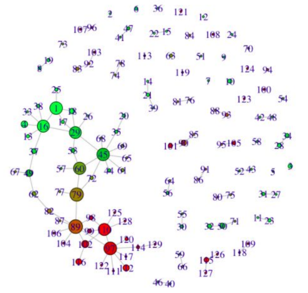 Perhaps even more interestingly, applying a continuous transformation to the similarity matrix significantly changed the output visualization -- when in theory, continuous transformations should not have any topological effects. To reconcile this finding, I constructed an example demonstrating how said theory can break when there are only finitely many data points. 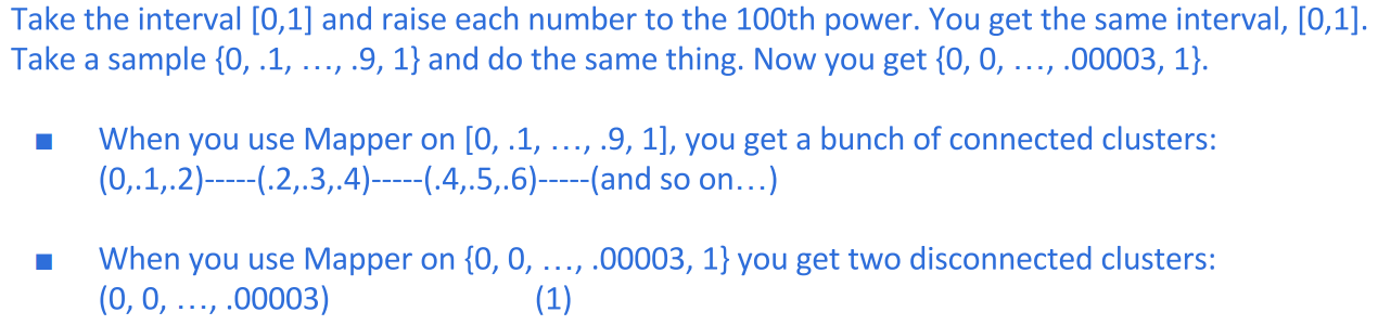 |
201607
Prototyped a method that would allow clients to run new data through models hosted in the cloud. Advisor: Dave Cieslak (Aunalytics) Presented at: Data Science Team and Brown Bag Lunch at Aunalytics Link: not available for public viewing Summary: The goal of this project was to take a step towards self-service analytics. Non-technical clients often have trouble deploying models that are built for them, and thus need an easy way to score new data without interacting directly with the model. To this end, I built a Shiny app to demonstrate a method that would allow model-builders to upload a model to a server, and model-users to run the model on new data by posting the data as a request to that server. On the front end, the app allowed the user to create a classification dataset and then play both the role of the model-builder and the model-user, building the model and using it to classify new data. 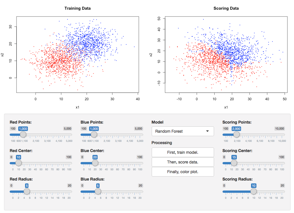 On the back end, the model was converted to PMML and uploaded to the openscoring server, the new data was posted to the openscoring server, and the scored data was returned as the response. 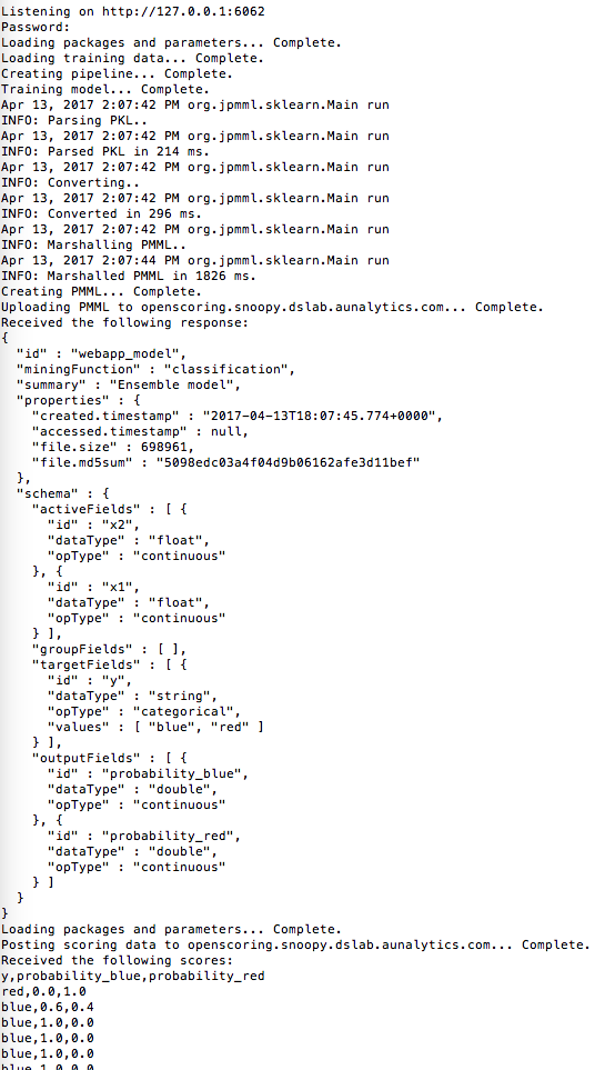 |
201606
Prototyped a method for exploring pairwise relationships in columnar datasets. Advisor: Dave Cieslak (Aunalytics) Presented at: Data Science Team at Aunalytics Link: not available for public viewing Summary: The goal of this project was to take a step towards automating the process of hypothesis generation in exploratory data analysis, by introducing a method for exploring pairwise relationships in columnar datasets. The method was based on a quantity I called the "discrepancy fraction," which is given by 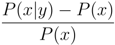 and which appears in many standard statistical quantities such as chi-squared and mutual information. I also built a Shiny app prototype of a tool that would use the discrepancy fraction to help analysts sort through all the relationships between features in a dataset.  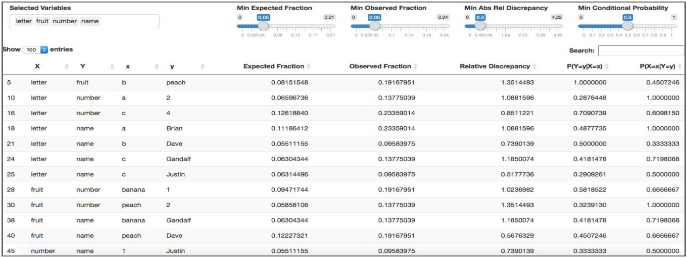 |
201605
Prototyped a solution for storing and displaying datasets, analytics notebooks, and visualizations. Advisor: Dave Cieslak (Aunalytics) Presented at: Aunalytics meeting Links: not available for public viewing Summary: The goal of this project was to prototype a system for storing and displaying datasets, analytics notebooks, and visualizations. My first iteration used GitHub Pages, and my second iteration made use of GraphDash. I also wrote functions to integrate the system with iPython notebooks, so that one could upload to the GraphDash server directly from an iPython notebook. 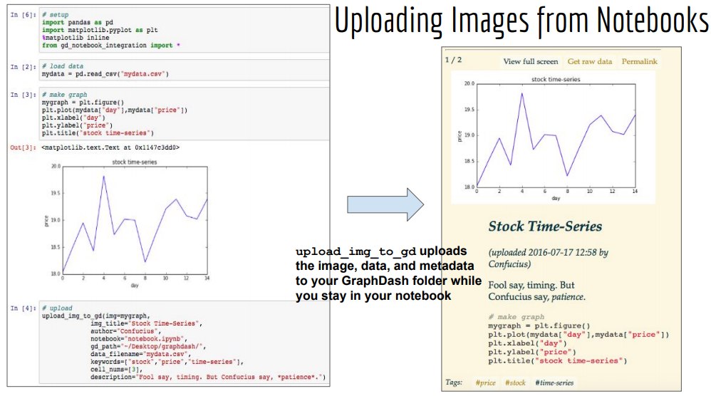 |
201604
Discovered a sales funnel for a banking client by generating a hierarchical clustering visualization of consumer service usage. Advisor: Dave Cieslak (Aunalytics) Presented at: Data Science Team and Consumer Insights Team at Aunalytics Links: not available for public viewing Summary: This is an exploratory analysis I made for a banking client who had data on its customers' account activities and service usages, and wanted to extract an actionable insight. First, I used the balances, transaction frequencies, and total cash flows of the accounts to cluster the accounts into 4 levels of health: high-activity accounts, medium-activity accounts, low-activity accounts, and accounts at risk of churn. Then, for each cluster, I created a heatmap to display the fraction of accounts that used each service. 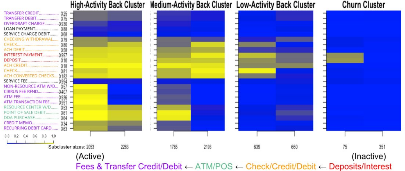 Laid side by side, the heatmaps revealed a hierarchy in transaction types: accounts at risk of closing tended to use only deposits/interest, low-activity accounts additionally used check/credit/debit, medium-activity accounts additionally used ATM/point-of-sale, and high-activity accounts additionally used fees and transfer credit/debit. This hierarchy could be interpreted as a sales funnel, telling which particular services could be pushed on a customer in attempt to nudge their account toward a level of activity. I also looked for telltale signs in account activity preceding churns. Since I was not able to find any through manual search nor visual inspection, we turned to machine learning for churn prediction. |
201603
Found a general principle of network reorganization for random sparse neuronal networks in response to periodic stimulation. Showed that "seizure-like" activity can arise if the refractory period is sufficiently low. Advisor: Dervis Can Vural (Notre Dame) Presented at: Many-Body Physics & Biology Group at Notre Dame's Interdisciplinary Center for Network Science and Applications (iCeNSA) Link: slides Summary: The goal of my project was to simulate and intuit how a neuronal network activates and reorganizes in response to periodic stimulation. My simulation consisted of a couple hundred neurons and displayed the activation patterns and weight changes that resulted from stimulating a subset of neurons with a periodic pulse. Under normal conditions, the network gradually reorganized itself so that only the neurons that were directly stimulated became active. 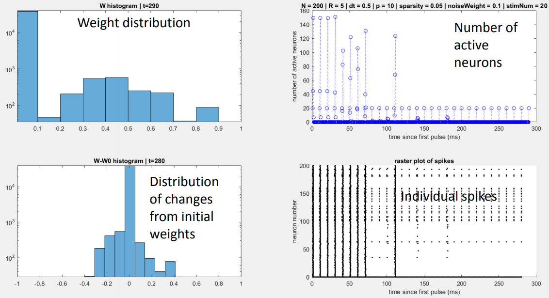 I also observed that when the refractory period was reduced to a fifth of its normal value, the network activity skyrocketed prior to reorganization, somewhat reminiscent of a seizure. 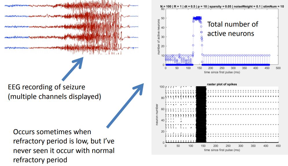 |
201602
Solved a special case of how to periodically stimulate a neural network to obtain a desired connectivity. Advisor: Dervis Can Vural (Notre Dame) Course: ACMS 80770 (Topics in Applied Mathematics) at Notre Dame Link: writeup Summary: The goal of this project was to create a simple neural network model with a biologically realistic learning rule, whose changes in connectivity could be derived analytically. After creating the model, I derived rules for how periodic stimulation of a single neuron would change the connectivity of the network, in the case of a tree network. 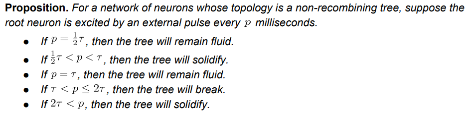 Then, I used those rules to come up with two-neuron stimulation patterns to solidify or break connections in the tree as desired. |
201601
| Making Indirect Interactions Explicit in Networks (2016) Described a concrete interpretation of weighted categories as explicit representations of indirect interactions within networks. Link: writeup Summary: After reading about Ehresmann & Vanbremeersch's Memory Evolutive Systems and Robert Rosen's Relational Biology, I tried to come up with some concrete takeaways. The main theme seemed to be that category theory provides a language for explicitly describing indirect relationships in graphs -- which, while semantically interesting, is ultimately just semantics. |
201509
Used game theory to show that social distancing advice during epidemics is generally useful, and extremely useful when very few people are immune to the disease. Course: EE 67045 (Static and Dynamic Game Theory), taught by Vijay Gupta at Notre Dame Link: writeup Summary: The goal of this project was to use game theory to evaluate the effectiveness of social distancing advice during epidemics, in which people avoid exposure to disease by avoiding physical proximity with others. Agents choose a number of social connections to keep, and have a payoff function that depends on two competing factors: the number of connections and the probability of remaining healthy. Health officials advise agents to keep a particular number of connections that would maximize everyone's expected payoff if everyone kept that number of connections. In the absence of advice, it is assumed that agents maximize their expected payoff in the worst case, when every neighbor who is not immune becomes infected. 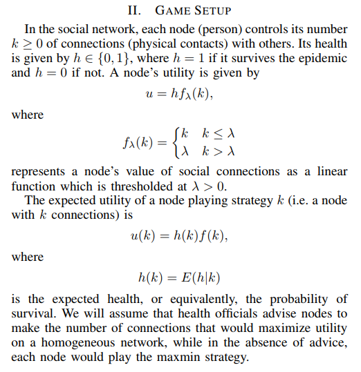 I found that following social distancing advice always allowed agents to keep several connections while maintaining a payoff, wherease in the absence of social distancing advice, agents would nearly or fully isolate themselves and even then could expect a payoff only a fraction the size of that under social distancing advice. |
201508
Simulated how cyclic neuronal networks ought to change, under a particular theory of neural plasticity, in response to periodic stimulation. Advisor: Dervis Can Vural (Notre Dame) Presented at: Notre Dame College of Science Joint Annual Meeting (COS-JAM) 2015 Link: slides Summary: The goal of this project was to understand how cycles of neurons ought to change connectivity in response to periodic stimulation, under an experimentally observed plasticity rule. I derived theoretical expectations for the case of "sequential spiking," in which exactly one pulse is traveling around the cycle at a given time, and ran simulations with biologically realistic neuron models to verify the results. 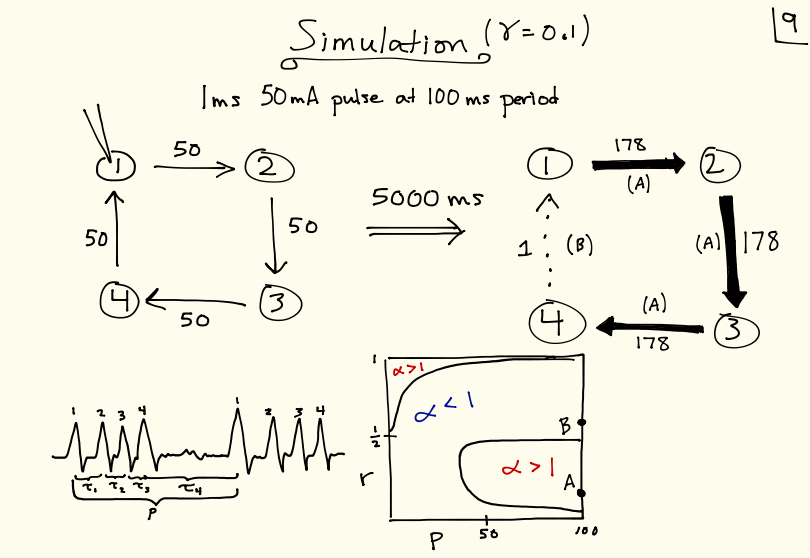 |
201507
Implemented spiking neurons in a deep neural network, in attempt to emulate brain waves. Advisor: Garrett Kenyon (Los Alamos National Lab) Summary: The goal of my summer project was to implement spiking neurons and observe "brain oscillations" in an open-source deep learning framework called Petavision. To implement spiking neurons, I had neurons inhibit themselves, so that they would reset whenever they became active.  However, I did not observe any oscillations in spike rates, and the network performed poorly on image reconstruction tasks, likely because the training algorithm was tailored to non-spiking neurons. It was beyond the scope and duration of the project to create a new training algorithm tailored to spiking neurons. |
201505
Conducted numerical experiments on an open problem in mathematics to reveal both surprising behavior and general underlying principles. Advisor: Jeff Diller (Notre Dame) Appeared in: Scientia Journal of Undergraduate Research 2015 Links: paper, preprint Summary: Start with any positive whole number. If it is even, divide by 2; if it is odd, multiply by 3 and add 1. Do it again, and again, and so on -- for example: 3,10,5,16,8,4,2,1. The 3n+1 problem is to prove that no matter what number you start with, you will eventually reach 1. At surface-level it seems like there should be a simple solution, but it has remained unsolved for over 70 years and is thought by some mathematicians to require the use of mathematics far beyond that of our present knowledge. In this project, I extended the 3n+1 problem to the set of real numbers using a continuous sinusoidal function that maps every even number to half of itself, and every odd number to one more than three times itself. 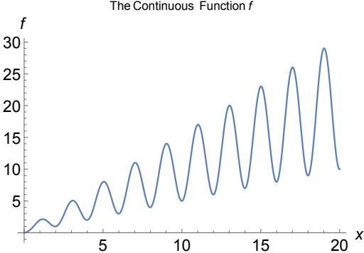 Repeated application of this function appeared to eventually map every real number to the interval [1,2] -- however, and quite interestingly, iteration sequences often differed wildly for input numbers seemingly very close together. 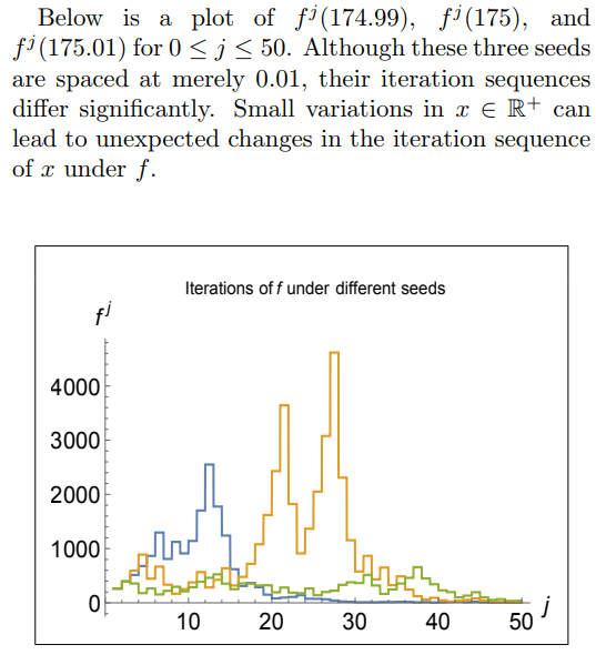 I also generalized the 3n+1 problem to the an+b problem and found that the decreasing end-behavior tends to break just above a=3, which is surprising because if the numbers in an iteration sequence have equal chance of being even or odd, then the cutoff should not be until a=4. However, by comparing the increasing vs decreasing area in the continuous version of the an+b problem, I was able to justify the a=3 cutoff. |
201504
Presented a friendlier version of a complicated proof in dynamical systems, using extensive visual diagrams. Advisor: Jeff Diller (Notre Dame) Links: html; pdf Summary: Dynamical systems are objects whose states change over time according to an update function. It is often useful to know about the periodicity of points in the system as they are iterated by the update function -- for example, equilibrium states are points with period 1, and other periods can reflect predictable state cycles. In this writeup, I present and visually illustrate a known proof of Sharkovsky's Theorem, which tells us the order of periods of periodic points. 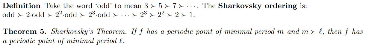 |
201503
Presented background and applications of quaternions, including a famous result. Advisor: Frank Connolly (Notre Dame) Link: writeup Summary: We begin with a historical background of Hamilton's quaternions and a review of their defining properties. We show that the quaternions form an algebra, and we prove the Skolem-Noether theorem for pure quaternions.  We show that the result of the theorem gives physical meaning to automorphisms of pure quaternions. Lastly, we present an application of quaternions to number theory. |
201502
Explained the basics of how computers work, from circuitry to the internet. Link: article Summary: In this article, we learn - in simple terms - how computers work. Rather than focusing on the nitty-gritty details and countless acronyms, we take a bird's-eye view as we soar from circuitry to the internet. We also structure our journey in a problem/solution approach so that we understand why things are the way they are in the world of computers. 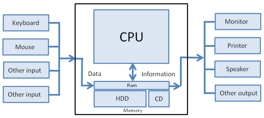 |
201501
Explained the basic functional principles of how the brain computes. Link: article Summary: In this article, we summarize the brain in a single sentence. At first, the sentence seems like gibberish, but throughout the article we build up our knowledge base so that we can build up our understanding of the sentence. Then, we can remember all the main ideas in the article by remembering the sentence, which now makes good sense to us. 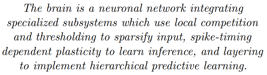 |
201403
Constructed and proved a closed-form expression for decomposing a rational expression (expanded polynomial)/(factored polynomial) into partial fractions. Links: proof of lemma (html, pdf), full notes (rough) Summary: Constructed and proved a closed-form expression for decomposing a rational expression (expanded polynomial)/(factored polynomial) into partial fractions. Lemma 1 tells you how to decompose a rational expression into a sum of pieces $\frac{x^m}{(x+a)^n}$. Lemma 2 tells you how to decompose those pieces into partial fractions (and uses a proof by double induction). In section 3 I combined those two steps into a single formula. (Caveat: there is some algebra mistake in section 3 that I never got around to tracking down and fixing) |
201402
Explained the math and physics behind an egg drop experiment for a student who was interested in Lord of the Rings and Star Wars. Link: packet Summary: While being chased by a troll, we learn about concepts like velocity, momentum, force, and pressure. 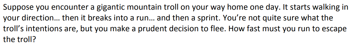 We realize we cannot outrun the troll nor defeat it by throwing rocks at it. However, we come up with a better strategy: we jump off a ledge, and when the troll follows, its stiff legs crack under its own weight. This is analogous to what happens in an egg drop. |
201401
Helped improve data transmission in a light-based particle detector by finding the optimal pair of light-producing and light-propagating materials. Advisors: Dan Karmgard, Mark Vigneault (Notre Dame) Collaborator: Andrew Henderson (assisted in data collection) Presented at: Indiana Junior Science and Humanities Symposium 2014, Northern Indiana Regional Science/Engineering Fair 2014 Link: poster Summary: The Compact Muon Solenoid (CMS) detector is a general-purpose particle detector located on the Large Hadron Collider at CERN. It gathers particle collision data in the form of light: particle sprays pass through scintillating tiles lining the interior of the detector, causing the tiles to emit light, which is then wavelength-shifted and sent to the data processing center via fiber optic cables. 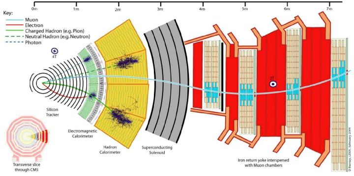 The goal of my project was to find the optimal pair of scintillating and wavelength-shifting plastics, to be replaced during the detector upgrade. Using a small radioactive source in a light-tight box, I collected a light output intensity histogram for each pair of scintillating and wavelength-shifting plastics, and found a pair that outperformed the pair previously used in the detector. 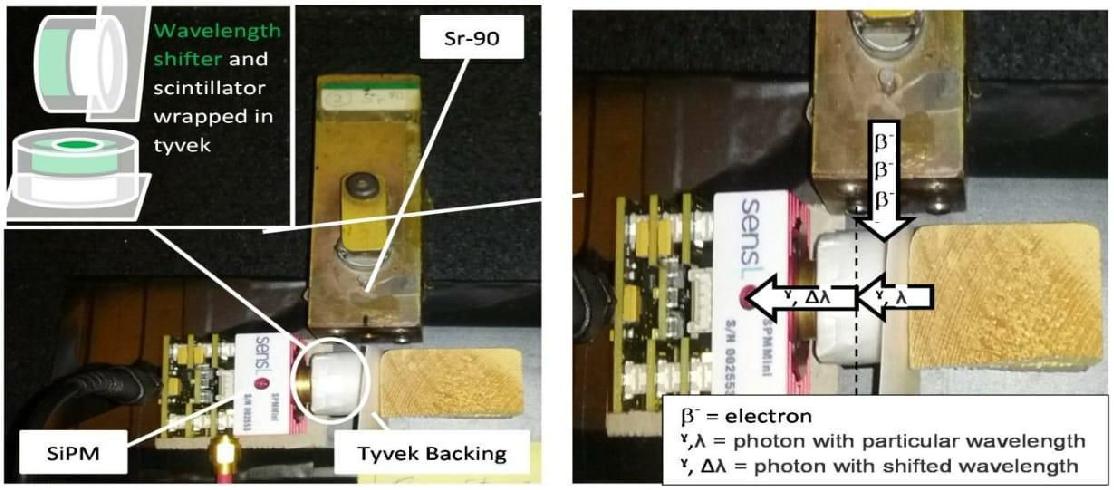 I also found an optimal pairing for long optical fiber arrangements, where minimizing light attenuation becomes more important than maximizing light generation. |
201301
Helped improve data transmission in a sound-based particle detector by creating a sound-absorbing material. Advisor: Ilan Levine (IU South Bend) Presented at: Indiana Junior Science and Humanities Symposium 2013, Northern Indiana Regional Science/Engineering Fair 2013, Hoosier Science/Engineering Fair 2013, Intel International Science/Engineering Fair 2013, Indiana Academy of Science Talent Search 2013 Link: poster, writeup Summary: The COUPP experiment at Fermilab attempts to detect dark matter by analyzing the sound of collisions in a superheated liquid. When a particle whizzing through the air collides with a particle of the liquid, the energy from the collision creates a bubble in the liquid, and the superheated temperature of the liquid allows the bubble to greatly expand. The formation and expansion of the bubble sends sound waves throughout the liquid, that are picked up by sound sensors attached to the container in which the liquid resides. Each particle has its own "bubble sound" fingerprint, and the sound data can be used to identify the type of particle involved in the collision. 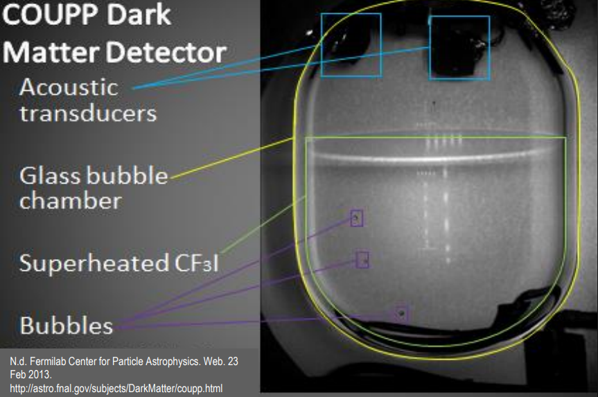 The goal of my project was to create an intermediate material to put between the container and the sensors, that would increase sound transmission by better matching the "acoustic impedances" of the container and sensor and thus reducing the amount of reflected sound. I engineered a material with the correct acoustic impedance by mixing together varying amounts of tungsten powder and epoxy, and it unexpectedly damped the sound signal rather than amplifying it, possibly due to density fluctuations within the mixture. 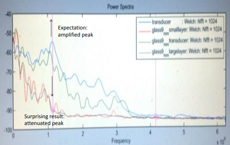 However, the sound-damping material still found use as a backing layer on the sensors, where it improved sound transmission by reducing excess vibrations and ringing within the sensors. |